Interview Analytics in the Survey-Style Dashboard You’re Used To

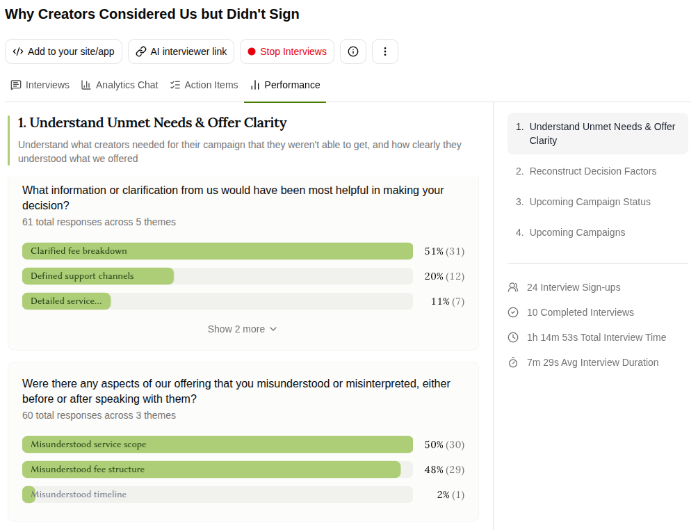
The new Performance tab shows every response from your research grouped into themes and sorted by how often it came up — so you can see what your whole study is saying at a glance!
Also in this release:
- Charts and tables on request in Analytics Chat
- Study stats: sign-ups, completions, interview time
Numbers you can show. Answers you can use.
You need a number to take into a meeting. So you send a survey, two hundred people tick a box, and you get a clean chart saying cost was the top factor — with no idea what any of them meant by cost.
So you run interviews instead. You get the why in vivid detail from ten people, you finally understand the problem, and then someone in the room asks how representative that is…
Now the Performance tab gives you both, from the same study!
With smart follow-ups and different touchpoints throughout the conversation, Frank might get multiple responses to the same question from the same customer over the course of a 5-minute interview.
It reads like the survey dashboard you're already used to. The difference is that every bar is made of real conversations, and you can open it and hear them.
And now you can see them all at a glance!
What to do with it
Every bar opens into the real quotes. Click a theme and you'll see the individual responses inside it, attributed by name, each with a link that jumps to that exact moment in the interview. So "44% said cost" stops being a statistic and becomes four people you can put on screen, in their own words.
One interview answers a question more than once. A survey of 10 people gives you 10 data points. But sending Frank out to interview 10 customers might produce 100s of data points! Because people in conversation don't give you one answer, they give you the answer, then the caveat, then the real reason. And then they reiterate or paraphrase themselves 4 minutes later when you ask them something else… and now you can see them all.
Your Research Guide shapes the dashboard. Themes sit under the question that produced them, and questions sit under the research goal you set during setup. You're not reading a generic report — you're reading answers to the questions you set out to ask.
Check how the study itself is going. You can now also review the performance of your study. Sign-ups, completed interviews, total interview time and average duration sit alongside the results, so you can see whether you have enough responses to trust yet.
Getting started
- Open a research project with completed interviews and go to the Performance tab.
- Pick a research goal from the list on the right to jump to its questions and themes.
- Click any bar to read the responses inside it, then “Jump to interview” to hear it in the customer's own words.
Full setup steps are in the knowledge base.
Charts on Request in Analytics Chat
The Performance tab covers the view you'll want most often: every question, every theme, sorted by frequency.
But what about when you need something it doesn't show?
Just ask for it!
Analytics Chat will build charts and tables on request — correlations between responses, or every mention of a particular theme pulled out on its own.
And because it's a conversation, you don't have to know what you're looking for before you start. You can follow the thing that looks odd in the Performance tab until it turns into an answer.
Frank runs your customer interviews so you can get back to building. Now it hands the results back in a format you can act on and share — the numbers to make the case, and the recordings to back it up.
If you've been running surveys because interviews were too much work, this is the release that closes the gap.